Have you ever looked at a scrapbook layout and felt an instant emotional connection—whether it was warm and nostalgic, playful and fun, or calm and soothing? That’s the power of color! Choosing the right colors for your scrapbook pages can make all the difference in how your memories are preserved and how they make you (and anyone flipping through) feel.
Let’s break down some basic color theory principles and how you can use them to enhance your scrapbook designs.
Understanding the Basics of Color Theory
Color theory isn’t just for artists—it’s a handy tool for scrapbookers too! Here are the key components:
- Primary Colors – Red, blue, and yellow. These are the building blocks of all other colors.
- Secondary Colors – Green, orange, and purple, created by mixing two primary colors.
- Tertiary Colors – Colors like red-orange or blue-green, created by mixing a primary and a secondary color.
When selecting colors for a scrapbook page, you’re not just choosing what looks good—you’re choosing a mood, a theme, and a story.
How Color Affects Mood in Scrapbooking
Different colors evoke different emotions. Here’s a quick guide:
- Warm Colors (Red, Orange, Yellow) – These bring energy, warmth, and excitement. Perfect for birthdays, celebrations, and summer-themed pages.
- Cool Colors (Blue, Green, Purple) – These give a sense of calm and relaxation. Ideal for nature layouts, baby albums, and sentimental themes.
- Neutral Colors (Beige, Gray, White, Black) – These balance out brighter colors and create a sophisticated, timeless look.
Popular Color Schemes for Scrapbook Pages
Using color combinations thoughtfully can make your layouts look cohesive and professional. Here are a few tried-and-true methods:
1. Monochromatic (One Color, Different Shades)
- Example: A winter-themed scrapbook with various shades of blue.
- Why it works: Creates harmony and a soothing effect without being overwhelming.
2. Complementary (Opposite Colors on the Color Wheel)
- Example: A Christmas layout using red and green.
- Why it works: High contrast makes your page pop and adds visual interest.
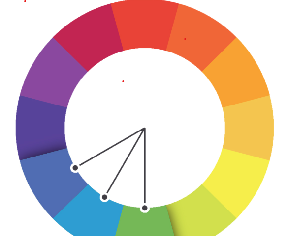
3. Analogous (Colors Next to Each Other on the Wheel)

- Example: A beach-themed page using blue, teal, and green.
- Why it works: Creates a natural, cohesive feel that flows beautifully.
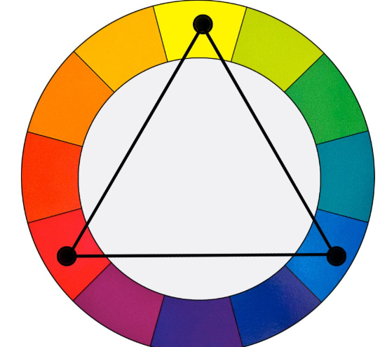
4. Triadic (Three Colors Evenly Spaced on the Wheel)

- Example: A birthday page using red, yellow, and blue.
- Why it works: Bold, playful, and great for fun, energetic layouts.
Practical Tips for Using Color in Your Scrapbook
Now that you understand the basics, here are some ways to apply color theory to your scrapbook layouts:
- Start with a Focal Color – Choose one main color based on the theme or feeling you want to convey.
- Use Photos as Inspiration – Pull colors from the most prominent hues in your pictures to create a cohesive look.
- Test with Swatches – Lay out different paper and embellishment colors before committing to a design.
- Add Contrast – Balance bold colors with neutrals to keep things from feeling overwhelming.
- Stick to a Palette – Too many colors can be distracting. Try limiting yourself to 3-4 main colors per layout.

Final Thoughts
Color isn’t just decoration—it tells a story. Whether you’re creating a scrapbook full of travel memories, family moments, or special milestones, understanding color theory will help bring your pages to life in a way that feels intentional and beautiful.
So next time you sit down to scrapbook, take a moment to think about your color choices. They might just be the magic ingredient that turns a simple layout into a masterpiece!
