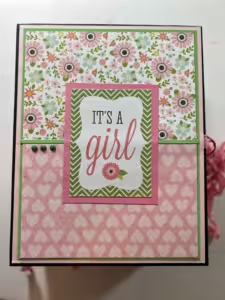
 From Blues to Brights: How Color Sets the Mood in Scrapbooking
Today, we’re diving into the vibrant world of color theory and how it can transform your scrapbook pages. Choosing the right colors isn’t just about what looks pretty—it’s about setting the mood and enhancing your theme. Let’s explore how different colors can impact your scrapbook designs, with some practical tips along the way.
Color theory is the study of how colors interact and the emotional responses they evoke. At its core, it involves the color wheel, which is divided into primary (red, blue, yellow), secondary (green, orange, purple), and tertiary colors (combinations of primary and secondary colors). Understanding these basics helps you create harmonious and visually appealing layouts.
Different colors evoke different emotions and can set the tone for your scrapbook pages. Here are a few examples:

Your color choices can also reinforce the theme of your scrapbook. Here are some practical examples:
Don’t be afraid to experiment with different color combinations. Scrapbooking is a personal and creative journey, so let your color choices reflect your style and the emotions you want to convey.
Understanding color theory can take your scrapbooking to the next level. By carefully choosing your colors, you can set the mood, enhance your themes, and create beautiful, cohesive pages that capture the essence of your memories. Happy scrapbooking!
We’d love to see your colorful creations! Share your pages with us on social media using #HeartAndHandCreations.
Thanks for stopping by, and happy scrapbooking!
Unlock the secrets of color harmony with my free Scrapbooker’s Color Theory Guide!
✅ Discover color combinations that enhance your scrapbook pages
Enter your email below to grab your free guide and start creating with confidence!
[📬 Sign Up & Download Now!]
